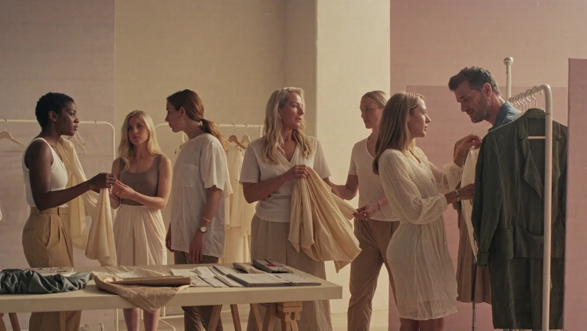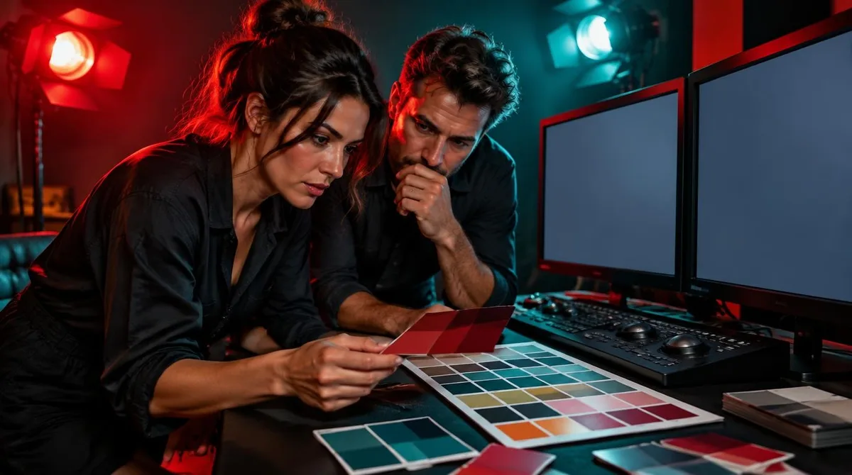
Color in film production is a language. Production designers, cinematographers and colorists choose hues the way writers choose words, and they do it early, often before a single set is built. A palette can tell you who holds power in a scene, when a character is changing, or that something is about to go wrong, all before anyone speaks.
The reason this works is not magic. It is perception. According to Wikipedia's entry on color, color is not a property of objects at all; it is a visual perception created when light of different wavelengths activates cone cells in the eye, and different colors have long been associated with emotions and activity across cultures. Filmmakers work with that association deliberately. They cannot control what a viewer feels, but they can control what a viewer sees, and seeing comes first.
This guide explains how that visual language works, who builds it, and why certain palettes keep showing up in the shows and films that trend on your feed. If you have ever noticed that every streaming thriller seems to live in the same cold blues, you are already reading the code.
Who actually decides the color of a scene?
No single person owns a film's palette. The production designer shapes it first, through sets, locations, props and wardrobe. The cinematographer shapes it again through lighting and lenses. Then a colorist works on the footage after the shoot, grading every scene toward the intended look. When the system works, the three stages agree, and the audience never notices the machinery.
The decisions usually start in preproduction, months before cameras roll. Designers build palettes around a character's arc or a story's theme, then carry those choices through costume, paint, furniture and even the color of practical lamps on set. A character who begins in warm, earthy rooms and ends in cold, bare ones has been given a visual sentence, and the viewer reads it without knowing they have.
It is worth separating two jobs that get blurred together. Production design decides what colors exist in the world of the story. Cinematography and grading decide how those colors are captured and finished. Both answer to the director, and both are answering the same question: what should this feel like?
How does a hue carry meaning without words?
Part of the answer is learned culture. Part is simple contrast. A designer does not need a color to mean anything on its own; the meaning comes from the pairing. If one character's world is saturated and another's is drained, the audience understands hierarchy and vitality without a line of dialogue. If danger has always arrived in one shade in a given film, that shade becomes a warning bell by the third act.
The craft term for pairing is color harmony, and color theory gives designers a working vocabulary for it: complements, balance, and the classification of primary, secondary and tertiary colors, as the color entry on Wikipedia describes in its summary of color theory in the visual arts. Complementary pairs, hues sitting opposite each other on the wheel, create tension and pop. Analogous schemes, hues sitting side by side, create calm. A designer shifts from one scheme to another, and the shift itself is information.
Lightness and saturation do quiet work too. The same hue reads differently at different intensity; Wikipedia notes that a low-intensity orange-yellow is perceived as brown, and that shifting a light's intensity can push a hue toward yellow or blue, an effect known as the Bezold–Brücke shift. On screen, that means a designer can keep the nominal palette constant while changing how it feels, simply by dimming it, washing it out or letting it burn. Readers following this should also see Quiet luxury: what the trend actually means and why it dominated 2023 to 2025.
Why do certain palettes keep trending?
Trends in screen color behave like trends anywhere else. One acclaimed production finds a look, other productions borrow it, and within a few seasons the look reads as a genre signal. The cool teal-and-orange pairing that dominated action posters for years, the desaturated greens of prestige dread, the candy pastels of a certain strain of wry comedy: each began as a specific choice and became shorthand.
Viewers then meet these palettes outside the screen. Stills circulate, mood boards form, and the colors migrate into fashion and interiors. That pipeline, from a single striking frame to a look you can buy, is the same mechanism behind most visual trends; how trends spread explains the mechanics behind a look that will not go away. A palette is unusually easy to copy, because it can be described in a handful of swatches. We covered a connected angle in How trends spread: the mechanics behind a look that will not go away.
Digital tools have sped the cycle up. The named colors of the web give anyone a shared reference point, and a chart of CSS named colors groups them into families with loose emotional associations, describing blues as trust and stability, yellows as optimistic and attention-grabbing, and purples as royalty and creativity, per the HTML color chart. Those associations are design conventions rather than laws of nature, but conventions are exactly what a production designer trades in.
What does a color grade change after the shoot?
A great deal. Grading is where the captured footage is tuned: shadows pushed toward one hue, highlights toward another, skin tones protected while everything around them shifts. Two scenes shot in the same room can finish in entirely different moods. The grade also keeps continuity, matching footage shot on different days, in different weather, under different light.
Colorists work in defined color spaces, the mathematical systems that assign numbers to every region of color so an image survives the trip from camera to cinema screen to phone. Wikipedia's overview lists familiar models such as RGB, CMYK and CIE Lab as the essential tools of color reproduction in photography, monitors and television. The artistry sits inside the math: a grade is thousands of small numeric decisions that add up to a feeling.
What this means for a viewer is simple. If a scene feels colder than the script alone justifies, someone chose that. The grade is not correction. It is the last pass of the writing.
How can you start reading color on purpose?
Practical steps, no expertise required. Pick one thing to watch for, and watch for it across a whole season rather than a single scene.
- Choose one hue per show and track where it appears. Note who wears it, which rooms hold it, and whether it shows up at turning points.
- Watch the transitions. Ask what changes in the palette when a character moves to a new place or a new phase of the story.
- Notice saturation. Ask whether the world gets more colorful or less as tension rises, and whether that pattern holds.
- Compare genres. A sitcom and a thriller may share a hue and use it for opposite purposes, which tells you the meaning lives in context.
Once you see the system, it is hard to unsee, which is part of the pleasure. The palette stops being decoration and starts being a second performance running alongside the actors.
The takeaway: color is a script you were already reading
The evidence for color's storytelling power is everywhere on screen, and its foundations are well documented: color is perception, not property, and its associations with emotion are cultural conventions that artists have used for centuries. Production designers and colorists simply apply those conventions with unusual discipline, scene by scene, until a palette becomes a character's shadow. The next time a show's look follows you out of the living room and into your wishlist, you will know why. The hue was doing its job.